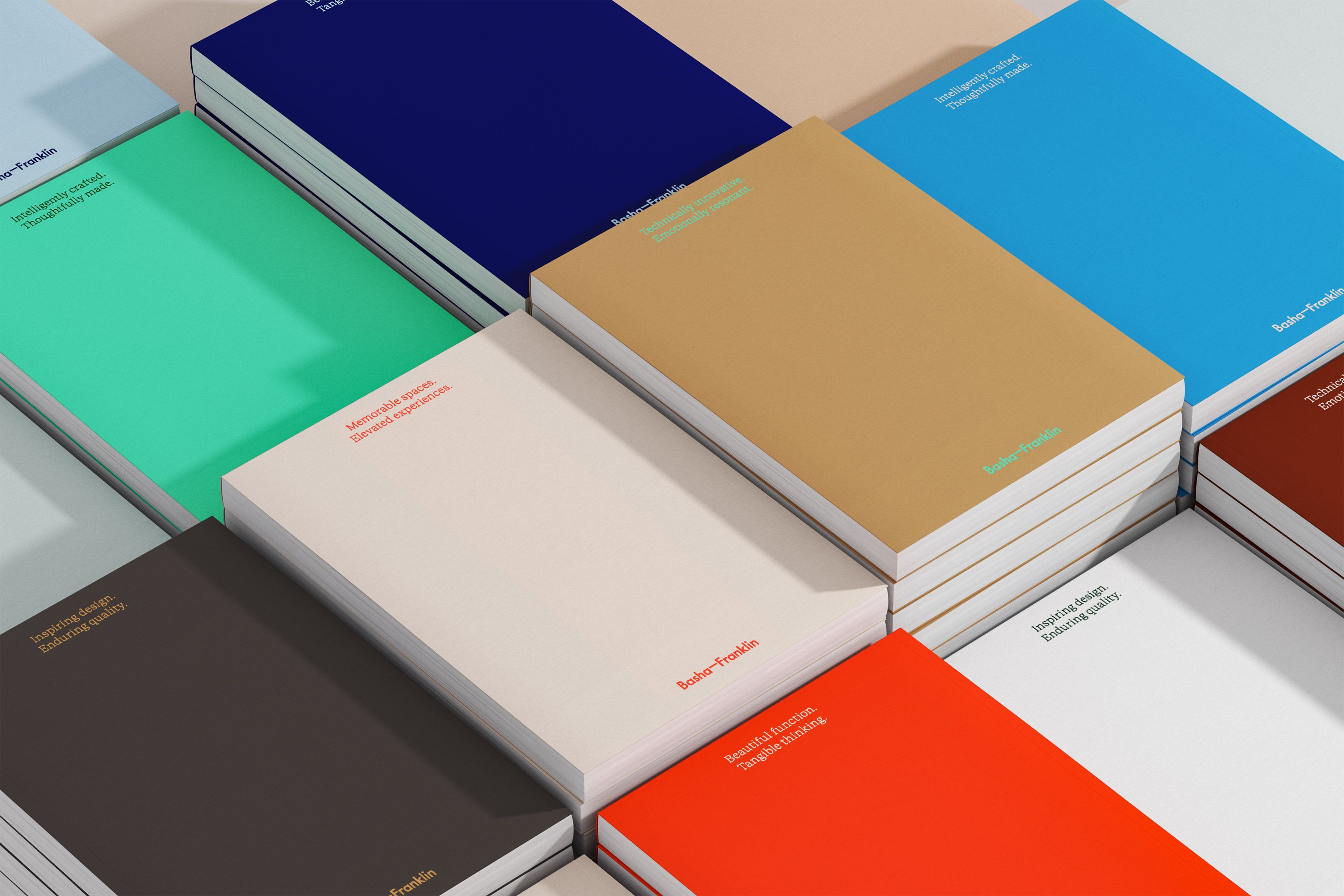
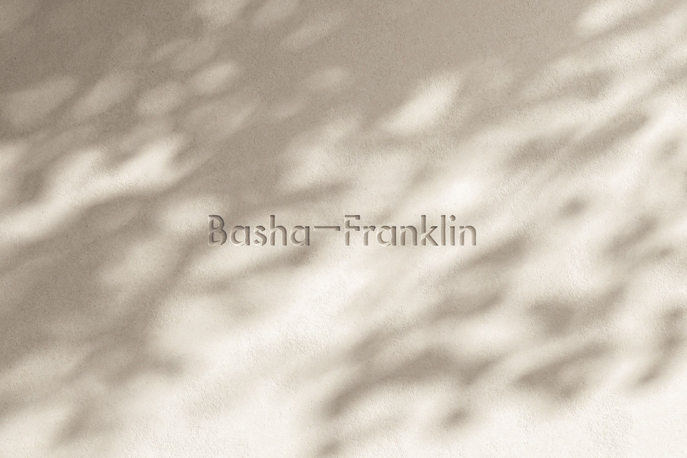
A new vibrant identity for interiors and architecture practice Basha-Franklin, where colours and language play an integral role in bringing their approach and work to life.
The Brief
Basha-Franklin’s old identity and website failed to capture the vibrant essence, breadth, and unique approach of their interior and architectural work. A new identity was needed to reflect the transformative and immersive nature of their projects. An identity that offers flexibility and communicates their brand values, messaging, and the innovative approach of their practice.
The Solution
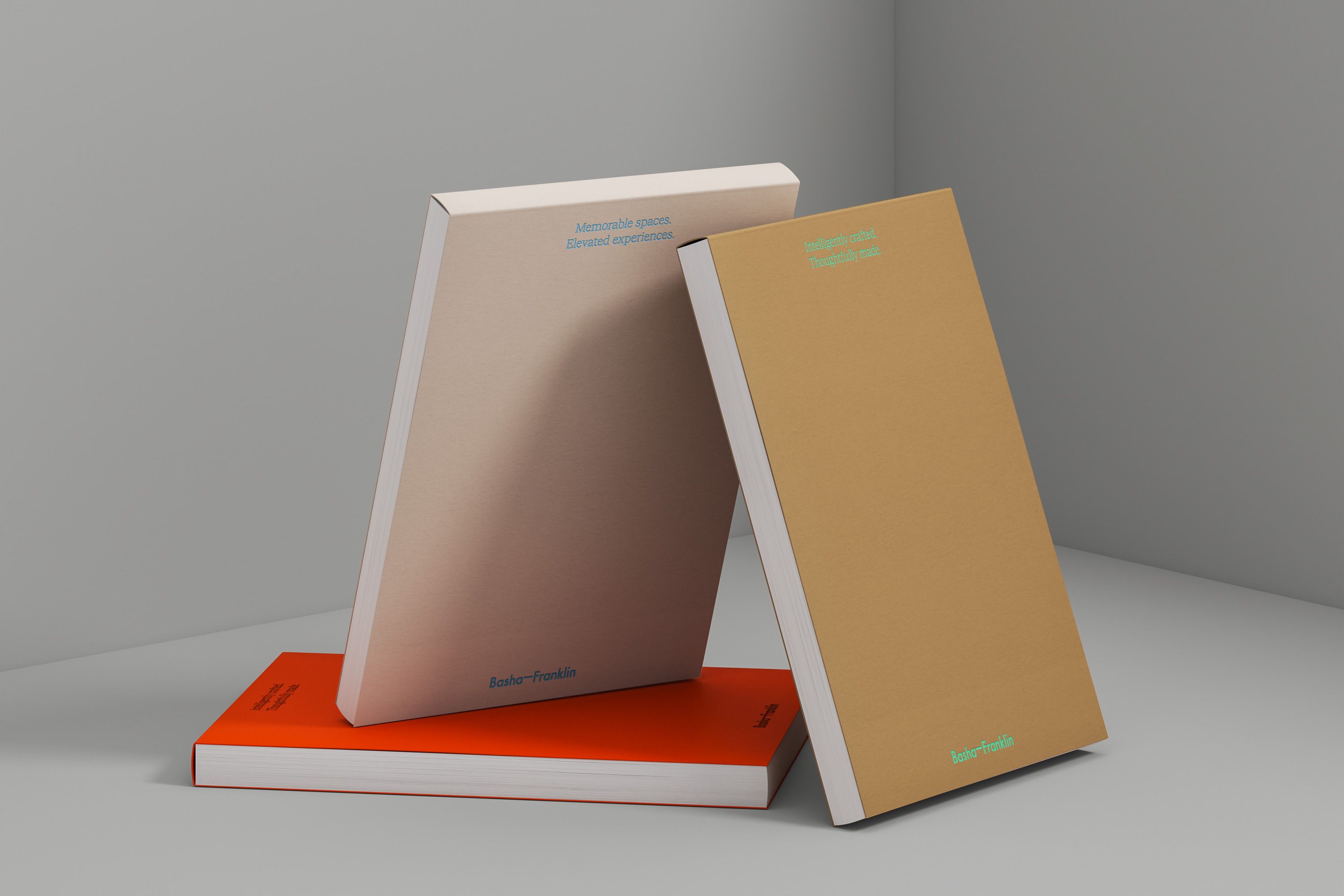
The focus of the new identity is a series of carefully crafted copy lines, communicating the brand’s values and messaging, and a new extensive colour palette consisting of vibrant hues, deep darks, and soft pastels, allowing for full flexibility across all brand collateral. The result is a brand that showcases Basha-Franklin’s ability to create buildings and spaces rich with meaning and generous in spirit.
The Client
Campbell Hay have transformed our vision into reality with expertise and creativity. A shared passion for our respective crafts aligned us from the start, making the process seamless, fun and rewarding. We’re deeply grateful to their team for launching our brand’s next chapter with an identity that truly reflects our work.
Rachel Basha-Franklin
Founder and Principal Director
Client
- Basha-Franklin
Industry

Carefully crafted brand copy applied across the brand’s collateral reflects Basha-Franklin’s unique approach and values.
An adaptable grid system accommodates varied content types and layouts, creating flexibility across the Basha-Franklin website and presentation documents.


